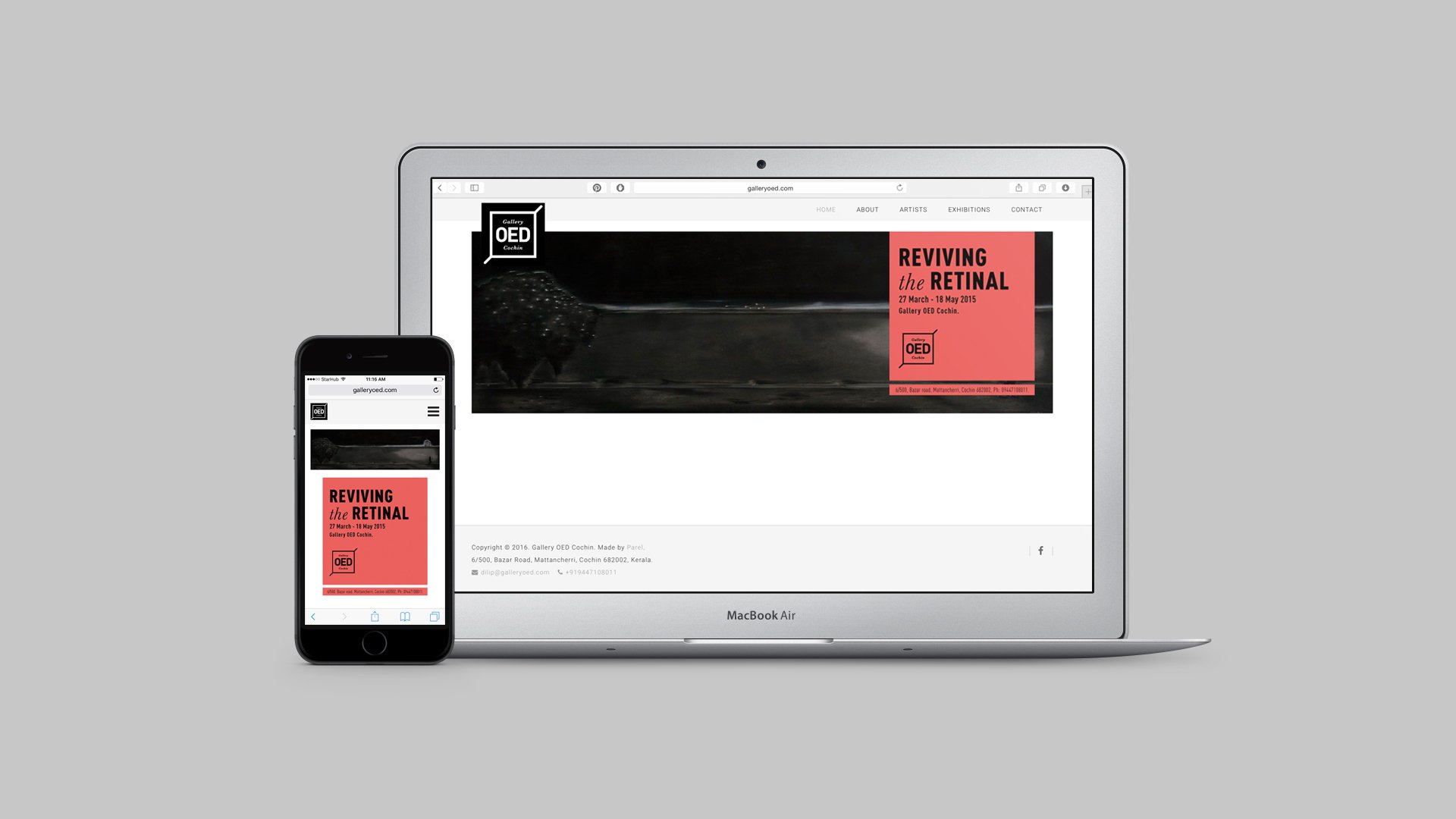
Brand Personality, Tone & Visual Identity for Gallery OED
We looked at direct and indirect competition - at other art gallery brands out there, and also at benchmark gallery brands from across the world.
We tried to understand the function of an art gallery. What purpose it serves and what forms it takes.
We looked at the worlds that come alive within an art gallery. We spoke to gallery owners and artists and curators and managers.
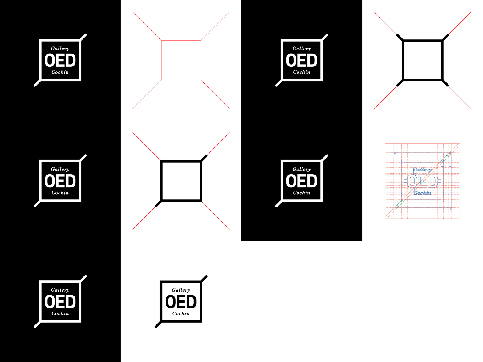
We arrived at lines and curves and being boxed in and thinking out of the box. At the four sided walls of a gallery space. At how the gallery forms the background for powerful expressions of art.
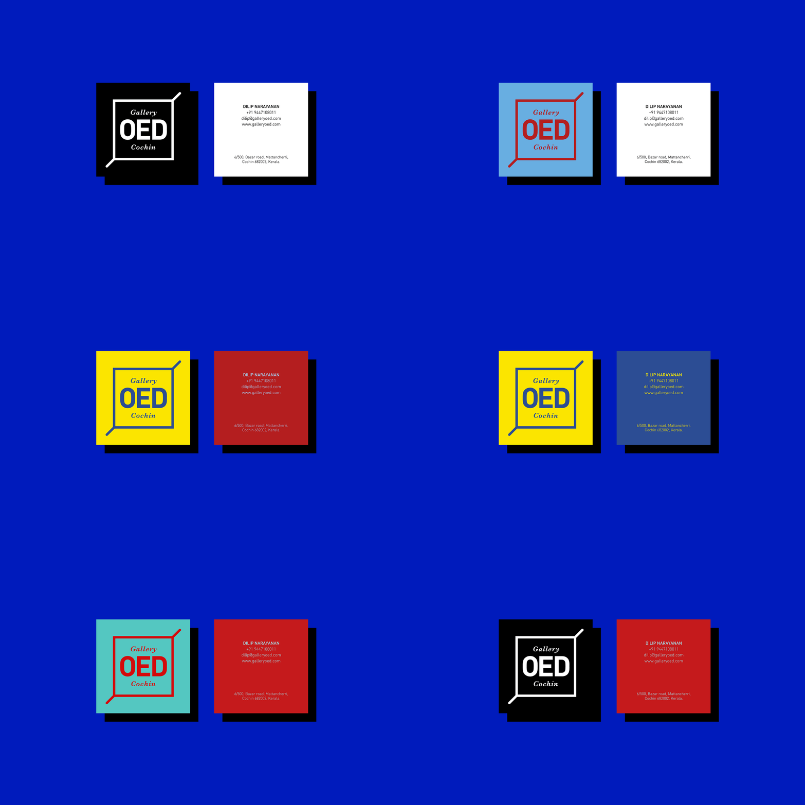
Then we distilled this down with the use of a grid, to reduce it to a very basic form. This was then injected with vibrancy with contrasting pairs of colours.


