Brand Refresh Project for Mantra
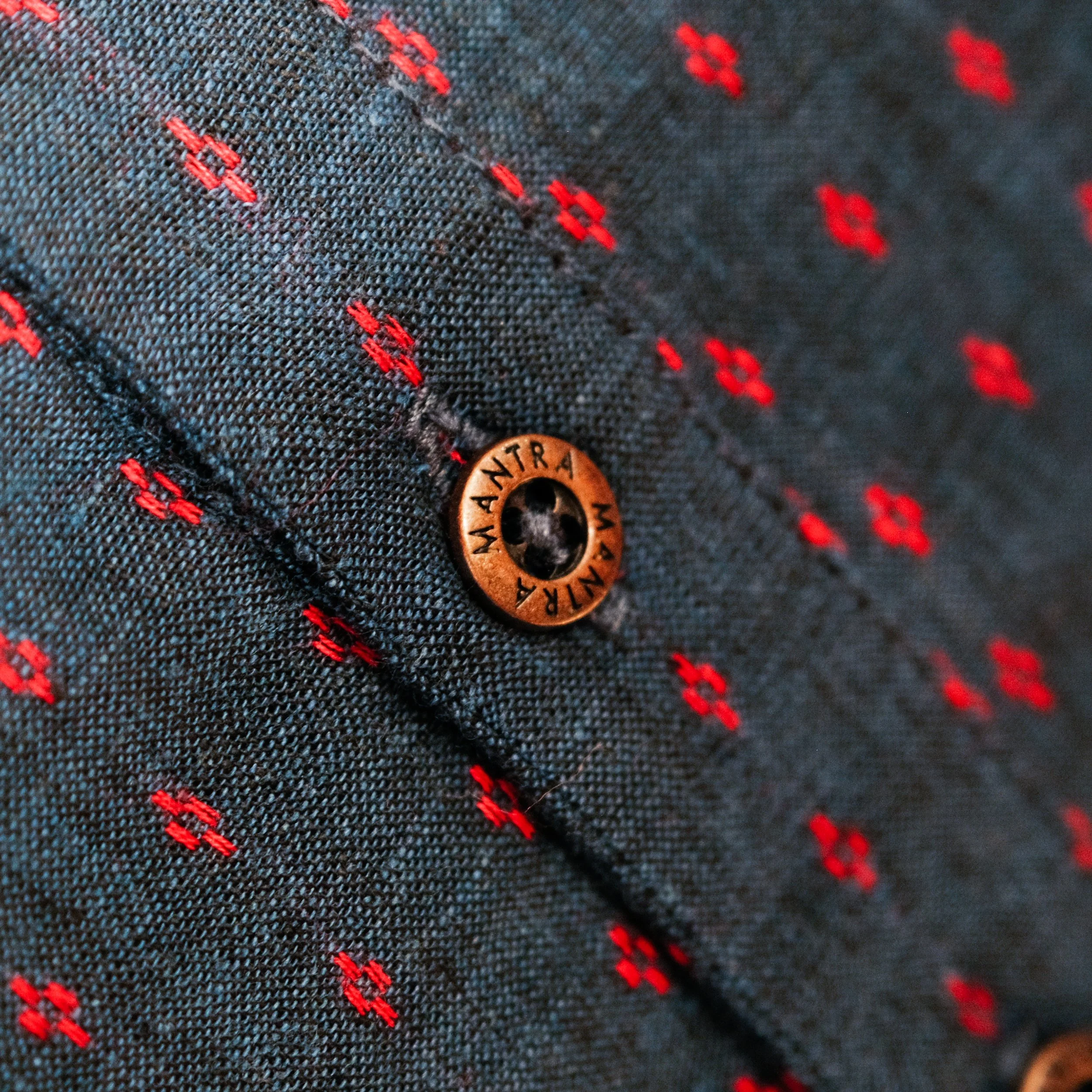
A leading design house manufacturing and retailing ready-to-wear or pret-a-porter clothing, this brand is rooted in handcrafted textile, and known for their attention to detail, fits, sizing, design and intensity of colours. It has stood the test of time and has so many positive associations. Mantra has been moving forward confidently, one step at a time, having carved a niche for itself in its signature style that is classy, sophisticated and subtly elegant.
We did a detailed brand immersion with sessions with the founder and lead designer, in depth research with brand loyalists as well as with competition preferrers, and an analysis of the category codes across segments in the fashion pyramid - Luxury Ready to Wear segment, Diffusion segment, Bridge segment & Mass Market segment.
We crafted a brand core for Mantra that was uniquely and credibly ownable - and used that as the foundation to create the Refreshed Brand Identity.
The logotype was chosen after an in depth session and discussion on the kind of brand personality the founder envisioned for her brand - detailing it out to the way this transforms into the form and elegance of the type. The brand colour palette was born from the core values of conviction, being rooted, confidence and stability. Versions of the key colours were identified to ensure the same colour effect is retained across expansive and smaller spaces, specifying which version to use accordingly.


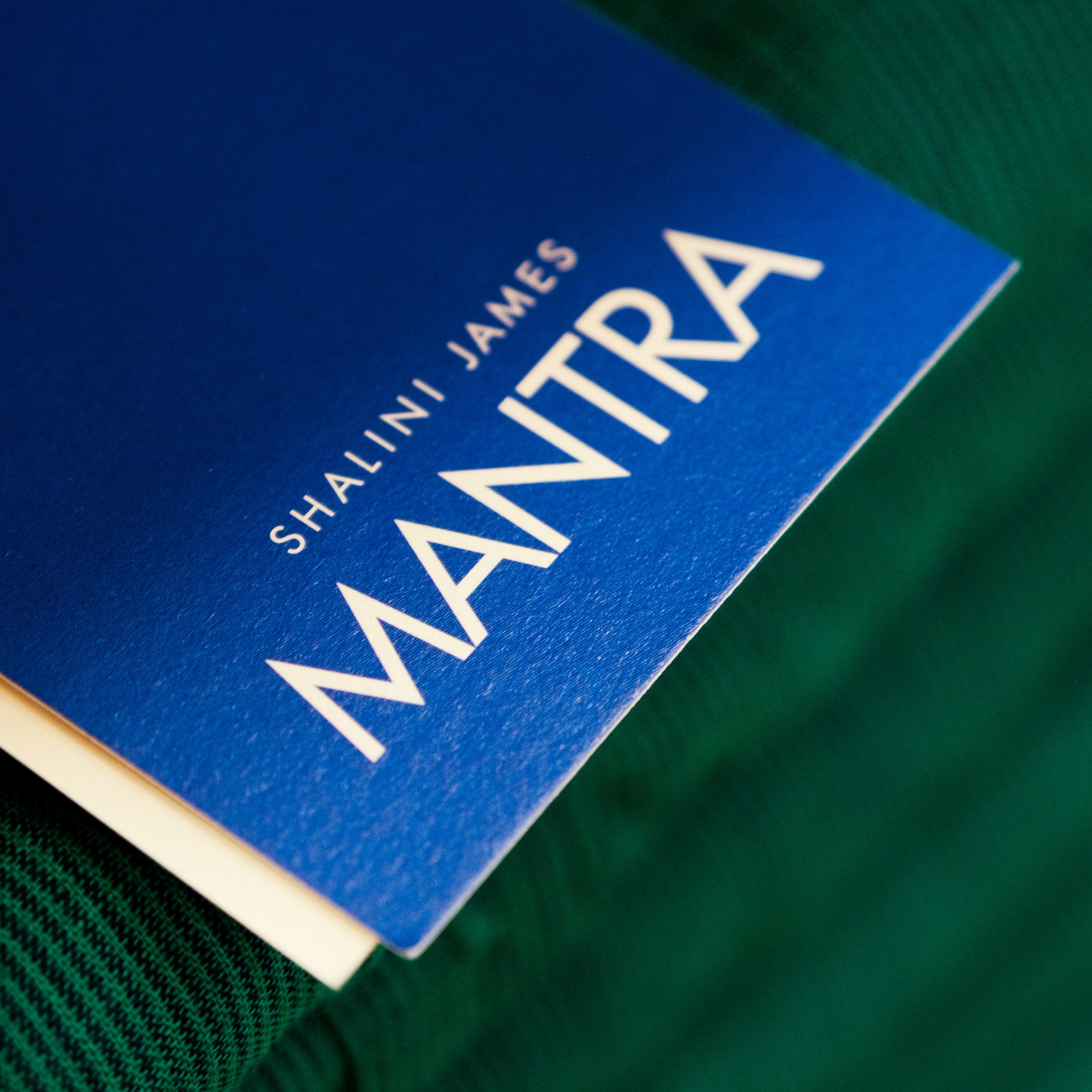
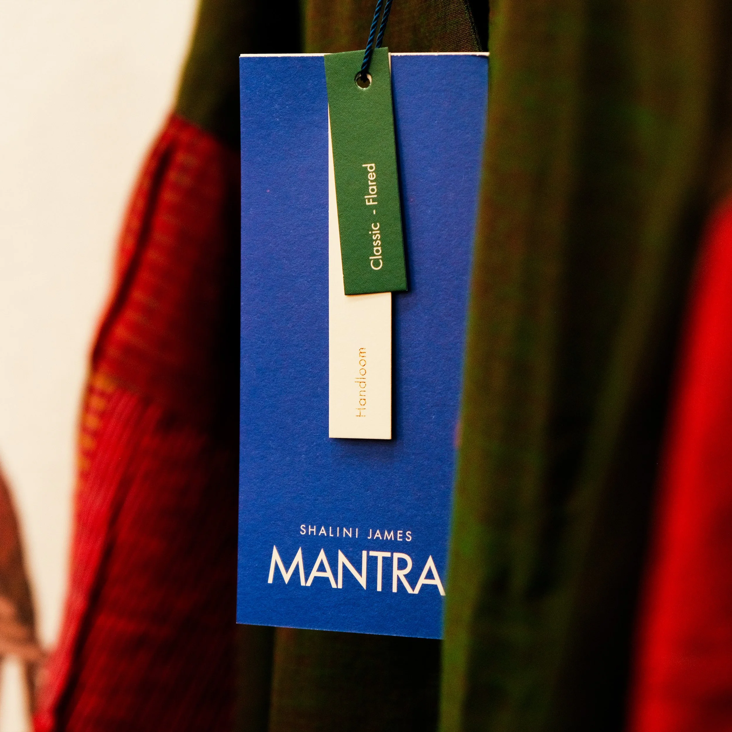
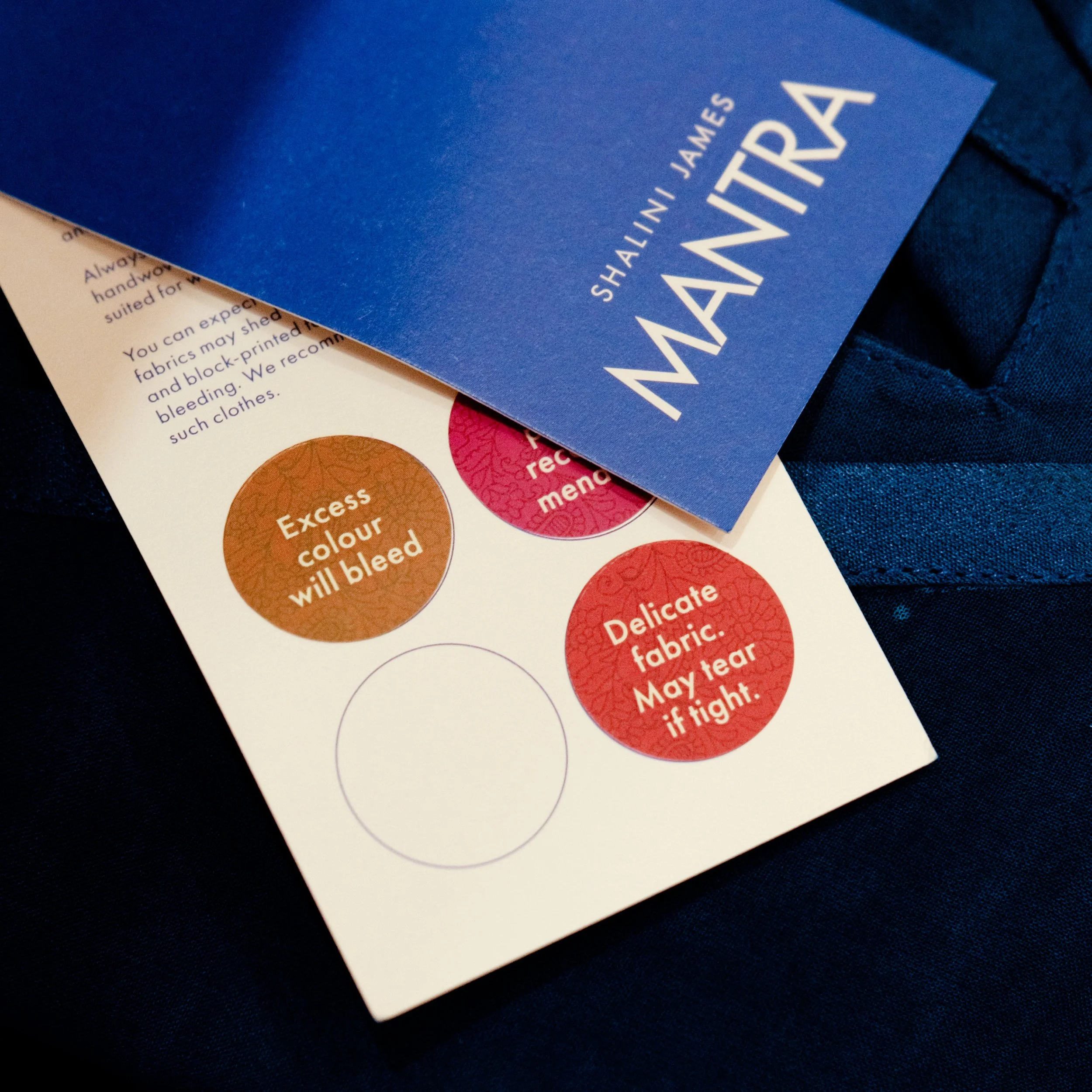
Some interesting design challenges were solved during the Mantra Brand Refresh journey. Simplifying and making sense of the multiple tags, was a task in itself. We used a distinct colour coding approach with varying sizes and shapes of tags that fall together as one unit. When we started off we had a whole bunch of information that had to be put out per garment with multiple tags, but definitely not wanting mini booklets to be attached per piece. We tried to make sense of all this information and created an easy to navigate tag segmentation approach conveying which piece is what. The result is the Brand Tag, the Craft Tag, the Fit/Cut Tag, the Wash Care Instructions Tag and Round Stickers for specific points to note per piece.
